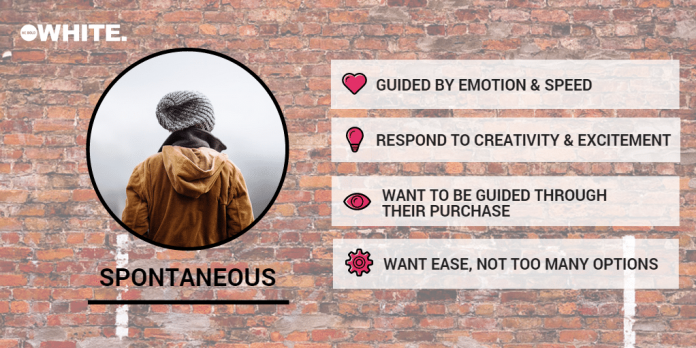
Most of us are spontaneous at one time or another, but some of us fit into that category more than others. Being one of those people myself (I once popped into Dixons at Gatwick airport to buy some headphones before my flight and came out 10 minutes later with a £500 camera) I thought I’d take a closer look into how e-commerce retailers are appealing to folk like us. As you can see, us spontaneous types are subconsciously targeted in many ways by e-commerce retailers.
But before we look at how e-commerce websites are appealing to those easily persuaded to shop off-piste, lets dive deeper into who these people are and what makes them smile…These individuals want movement, simplicity, and stimulation. They like things that are non-threatening and friendly. They hate dealing with impersonal details and cold, hard, facts. They are usually quick to make a decision and want to know why your product or service is best to solve the problem. They want a website to provide reassurances and credible opinions rather than options. They fear missing out on what life has to offer. They will not take time to rad a lot of content, so visual hooks are important as is skimmable short, snappy copy.
Creating the appeal
Now we know that we can’t appeal to all types of people across every website – we’d have a lot of confusing looking websites if we did. However, we can use on-page elements and functionality to address this type of user and cater for their needs.
Let’s look at some examples of how e-commerce retailers are doing this at the moment…
Example 1: Expedia
Expedia makes life for the spontaneous easier with their Sort By: Best Deals function. This allows Expedia to provide recommendations and the user feels like they are getting a bargain. Spontaneous people respond to this in a positive way. What is more, they respond to Fear of Missing Out (FOMO) – also called loss aversion in marketing circles – that this type of product listing promotes and are motivated by the loss aversion. Their spontaneity means they are more likely to act upon it. Particularly because the eye is drawn to movement.
Example 2: Boden
Similar to Amazon’s successful ‘Frequently Bought Together’ product marketing, Boden provides a helping hand for those spontaneous people, who like creativity and inspiration to be given to them. This represents a healthy amount of up-sell and is quite subtle in its tone.The clever copy utilised by Boden also implicitly suggests that your outfit/look will be incomplete if you don’t ‘bring it all together’. This copy is a great trigger for spontaneous types as we know they have a fear of missing out.
Example 3: Majestic Wine Warehouse
Majestic have created a great tool for those that log on to their website. For those planning a dinner party or something more special, their Wine and Food Matching tool is great. Not only does it remove the need to sift through thousands of bottles to find one that fits with your menu, it provides a carousel at the top of the page with 5 top recommendations for the selected food type.This guided action provides a valuable function to those spontaneous types who want to be escorted towards recommendations, narrowing down the choice by presenting them with fewer options and applying value judgements to these, thus making their decision easier. Interactive components tend to engage the spontaneous personality type.
Other key elements
Login and checkout with ease
Recognising the need for speed the two websites featured below have provided a range of options to speed up the customer journey through their website. Whilst the thought of linking up our whole online life and sharing so much data with the likes of Facebook or Google doesn’t appeal to all of us, the time we can save by logging in to these external sites in order to create an account is often to tempting to refuse.Likewise, allowing users to checkout as a guest is imperative to aiding the consumer journey of spontaneous types. You can read more on the importance of allowing guest checkout in this blog post by Econsultancy from September 2014.


