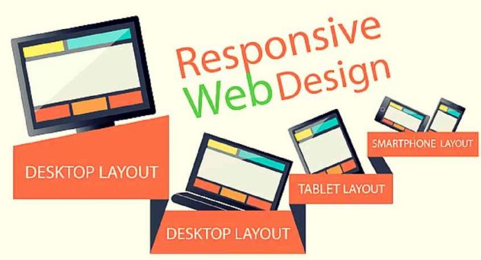
Responsive web design is the concept of designing a website that scales to various screen sizes. With the increase in web surfing from tablets and mobile devices a website needs to work at different screen dimensions and resolutions. The choice is to either build a mobile version, or have a website that scales responsively!
Currently the main “sizes” can be categorised as:
- 960px to 1024px (tablet landscape to standard desktop)
- 768px to 959px (tablet portrait to desktop)
- 480px to 767px (mobile landscape to tablet portrait)
- Less than 480px (mobile portrait)
So how do you create a website that is fluid and scales to fit these different sizes?
The secret lies in CSS3 media queries.
Media queries allow you to serve up different CSS styles depending on the current screen size. The great thing about this is that new devices (mobiles and tablets) will be able to use media queries, and old devices will just see the standard desktop web site.


